Banner blindness isn’t just a buzzword; it’s a survival mechanism. Modern users have developed a subconscious radar that completely filters out standard 728×90 and 300×250 ad units, leaving publishers with cratering click-through rates (CTRs) and diminished eCPMs. When every pixel matters, sticking to traditional display ads is like leaving money on the table.
The solution isn’t to scream louder with flashier animations. Instead, the magic happens when you integrate your monetization seamlessly into the user’s organic journey. By mastering non-intrusive native ad layouts, you can respect your audience’s attention while driving revenue that outperforms standard banners by a mile.
The Psychology of Banner Fatigue vs. Native Integration
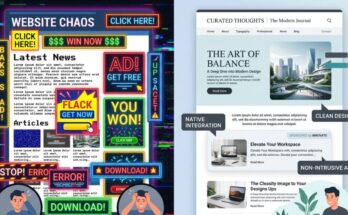
Why do standard banners fail so spectacularly in today’s premium content ecosystems? It comes down to cognitive load and visual disruption. When someone lands on your page, they are on a mission to consume content, and anything that looks like a corporate billboard gets instantly ignored.
Native advertising works because it aligns with user intent rather than fighting against it. By mimicking the visual design, typography, and structural hierarchy of the surrounding editorial content, native placements lower psychological friction. Users don’t feel like they’re being sold to; they feel like they’re discovering an extension of their reading list.
Expert Insight: In our internal testing across high-traffic US editorial sites, swapping a standard mid-article banner for an inline native content recommendation unit resulted in a 142% lift in viewable CTR. More importantly, our core user engagement metrics—like time-on-page—stayed completely steady.
When you focus on native ad design best practices, you aren’t tricking the user. You are simply presenting a paid message in a format that matches their current behavioral state. This structural alignment is exactly how premium publishers unlock high-tier advertiser demand and sky-rocket their programmatic yields.
Structural Blueprint: Mapping the Perfect Native Ad Unit
Designing a high-performing native layout requires meticulous attention to visual hierarchy. If your native unit sticks out like a sore thumb, it defeats the entire purpose. Conversely, if it blends in too perfectly without proper labeling, you run into regulatory trouble and risk damaging audience trust.
To achieve the ultimate balance of high engagement and strict compliance, you must dissect the anatomy of the ad layout. Every element needs to match your site’s CSS architecture perfectly. Let’s break down the core components required to build an elite, non-intrusive ad unit.
Matching Typography and Scale
Your native ad headlines must use the exact same font family, weight, and color as your organic article headers. If your site uses Inter or Roboto for headings, your native ad titles must inherit those exact styles. Even a slight variation in font rendering can trigger a user’s internal “ad radar” and cause them to scroll right past.
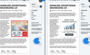
Image Aspect Ratios and Container Behavior
Never let native ad thumbnails look like standard promotional graphics. Use organic image ratios—such as 16:9 or 4:3—that perfectly mirror the thumbnail dimensions of your site’s recent posts or related articles widgets. Ensure the images are crisp, content-focused, and free of cheesy, high-contrast overlay text that screams “advertisement.”
The Art of the Subtle Disclosure
Compliance is non-negotiable, but it doesn’t have to ruin your design. Place a clean, minimalist “Sponsored” or “Promoted” tag in a muted gray font, utilizing a small 11px or 12px typeface. Position it consistently—either directly above the headline or in the bottom corner of the image container—so it is clear to human eyes but completely non-distracting during a casual scroll.
Strategic Placement Zones for Premium US Traffic
Where you place your native units is just as vital as how they look. Throwing a native widget into a cluttered sidebar is a recipe for mediocrity. To attract high CPCs and top-tier eCPMs from premium US advertisers, your ad placements must sit directly within the primary user focus zones.
Advertisers targeting US audiences are willing to pay massive premiums, but they demand exceptional viewability metrics in return. If your native layout sits in a dead zone, your programmatic floor prices will suffer. Here are the three power zones where native ad design best practices truly shine.
| Placement Zone | Viewability Rating | Primary Monetization Benefit |
|---|---|---|
| Mid-Article Inline (After Paragraph 4) | Exceptional (85%+) | Captures users at peak engagement during deep reading. |
| The Editorial Feed Split | High (70-80%) | Blends naturally into infinite scroll homepages. |
| Bottom-of-Article Content Wall | Moderate to High | Monetizes exit intent when readers look for “what’s next.” |
The Power of Mid-Article Inline Units
The sweet spot for inline native units is right after the third or fourth paragraph of your content. By this point, the reader is deeply invested in the article and moving down the page at a steady, predictable pace. Introducing a single-column, cleanly styled native block here ensures maximum viewability without breaking the editorial flow.
The Feed Split Layout
If your website relies on a card-based layout or a chronological content feed, use a split layout approach. Insert a native ad card every fourth or fifth slot within your main content stream. The ad card must share the identical padding, border-radius, and box-shadow styles as your organic post cards, making it an intuitive part of the browsing experience.
The Post-Article Recommendations Grid
When a user finishes reading your article, they face a decision point: leave your site or find something else to consume. Capitalize on this transition state by deploying a native recommendation grid. A clean 2×2 grid that blends two internal articles with two high-value external sponsored links keeps users engaged while maximizing your monetization potential.
Technical Optimization: Ensuring Lightning-Fast Rendering
A flawless native ad design means absolutely nothing if it lags during page load. Slow-loading ad scripts trigger layout shifts, ruin your Core Web Vitals, and tank your SEO rankings. US audiences possess notoriously short attention spans; if your native unit takes an extra second to render, users will scroll past an empty white box.
To prevent this, you must optimize how your ad codes interact with your site’s content delivery architecture. Modern programmatic native monetization requires an aggressive approach to performance engineering. Here is how we keep our native-heavy layouts blazing fast.
/* Minimalist CSS Example for a Seamless Inline Native Ad Container */
.advlume-native-container {
    width: 100%;
    margin: 2rem 0;
    padding: 1.5rem;
    border: 1px solid #e2e8f0;
    border-radius: 8px;
    background-color: #ffffff;
}
.advlume-native-title {
    font-family: 'Inter', sans-serif;
    font-size: 1.25rem;
    font-weight: 700;
    color: #1a202c;
    line-height: 1.4;
}
.advlume-native-disclosure {
    font-size: 0.75rem;
    color: #718096;
    text-transform: uppercase;
    letter-spacing: 0.05em;
}
Always utilize asynchronous loading tags for your native ad scripts so they don’t block the parsing of your main HTML content. Implement precise CSS aspect-ratio boxing on your ad containers to reserve the exact layout space before the ad asset arrives. This entirely eliminates cumulative layout shift (CLS), protecting your Google search visibility while keeping your monetization stable.
Measuring Success: KPIs That Prove Native Superiority
Transitioning from old-school banners to sophisticated native ad design requires data-driven validation. You cannot simply look at raw click metrics and call it a day. To truly understand how much value your new layouts bring, you need to track advanced performance indicators.
Focus your analytics dashboards on three critical metrics: Viewability Rate, Revenue Per Thousand Sessions (RPM), and Post-Click Dwell Time. When you monitor these KPIs, you will quickly see that native placements don’t just rival traditional banners—they completely outclass them across the board.
Elevating Your Viewability Floors
A standard leaderboard banner at the top of a page often suffers from low viewability because users scroll past it before it finishes loading. Because native layouts sit directly inside the content flow, their viewability rates regularly surpass 80%. Higher viewability scores instantly push your inventory into premium programmatic bidding brackets, attracting massive US brand budgets.
Maximizing Session RPM
Instead of judging success purely on individual ad unit performance, track your overall Session RPM. Because non-intrusive native ads preserve the user experience, bounce rates drop and pages-per-session increase. This means you get to serve more organic pageviews per user journey, multiplying your total site revenue without overwhelming your readers with ads.
Elevate Your Monetization Strategy Today
The era of intrusive, ugly display banners is drawing to a close. Publishers who refuse to evolve will continue to watch their click-through rates fall and their premium audiences tune out. Embracing native ad design best practices is the single most effective way to secure long-term revenue sustainability.
Take a hard look at your current website layout today. Identify your lowest-performing banner zones and replace them with clean, content-aligned native spaces. Your readers will thank you with deeper engagement, and your bottom line will reflect the undeniable power of premium, non-intrusive monetization.
Frequently Asked Questions
Do non-intrusive native ad layouts lower total site earnings?
Not at all. In fact, they usually increase total revenue. While they may look less aggressive than flash banners, their significantly higher click-through rates and superior viewability scores command much higher eCPMs and CPCs from premium US advertisers.
How do I make sure my native ads comply with FTC guidelines?
Keep your layout clear and transparent by using straightforward, legible disclosure labels like “Sponsored,” “Ad,” or “Promoted Offer.” Ensure the text color contrasts cleanly against your background and is placed close enough to the ad copy that a reader cannot miss it.
Can I build custom native layouts without advanced coding skills?
Yes, many modern ad platforms and advanced native ad networks provide intuitive, point-and-click layout builders. These tools allow you to easily match fonts, background colors, and image styling to your WordPress or custom site setup without writing extensive CSS from scratch.
Will switching to native layouts improve my site’s mobile user experience?
Absolutely. Traditional desktop banners often break mobile layouts or scale down so poorly that they become unclickable text blocks. Native ad containers adapt fluidly to any screen size, creating a vastly superior, native-feeling mobile reading experience.